Yoga Online Courses – What’s the name?
There are yoga online courses out there in the cyber space like sand on the beach. So why create one more? And how to go sure to still be there tomorrow?
One of the basics in online business is to find the ideal client and niche. Once they are found, we need to address her (sorry guys, my offer is still for ladies only) in a way she understands the offer and the benefits.
Therefore the name of the program is essential and also evolves over time, as the offer progresses. Here how Paths to Yoga evolved to Yoga 40 Plus.
First name and first logo
Paths to Yoga seemed an obvious name for my yoga online course to me. I wanted to make yoga accessible for ladies who never thought they could do it. They wouldn’t dare to start because of mindscrews like I’m too old, I’m too fat, I’m not flexible enough, I have no time, It’s only for the young and slim girls…. That’s also what I thought, when I started in the Russian yoga studio in Thailand.
These tall and slim girls perfectly mastered their poses, upside down and bending backwards till their body made a circle. I tried to hide in the last row whenever I could.
It took me several years to understand that yoga is not about perfection of the poses, but about awareness of ones body. That breathing and relaxation exercises are as beneficial for the body as they are for the mind. Meditation, mantra, yogic philosophy, there are so many ways to approach yoga.
First Yoga Online Course
When I first started practising yoga, it was to relieve the backpain due to long office hours. And it worked. Yoga for your Back was again an obvious name for the first yoga online course I created in summer 2019. Within 2 months I set up a landing page, the technic, created the course content, found 20 participants as beta testers and conducted the 4-week course.
The experience was amazing, but before starting sales, I wanted to deepen the benefits for the spine and made the certification in Svastha Yoga Therapy for lumbar spine and shoulders.
Is it because the certification gave me new confidence and enjoyment in the practise? The logo for the program got bolder letters, was well visible on the illustrations, which were mostly made during my travels.
In same time the retreats also were advertised with the new strong fonts.


First Redesign of Logo
The handwritten style of the company’s logo didn’t fit anymore. The fonts too thin and effaced. Paths to Yoga was redesigned to fit the new confident style.

New Yoga Online Course
The online yoga course Yoga for your Back had a regular group of ladies in 2021, some attending for over a year already. Despite, I felt I needed to offer something new. The ladies in my group were all over 40 and that’s what I targetted from the beginning. I started a research and discovered hormone yoga taught by Dinah Rodrigues. A couple of months later I made the certification and offered the program.
I took the big and confident fonts from Yoga for your Back and added a more playfull one for Hormone Yoga.
Another innovation: I started conducting the classes in German, in addition to the English sessions.


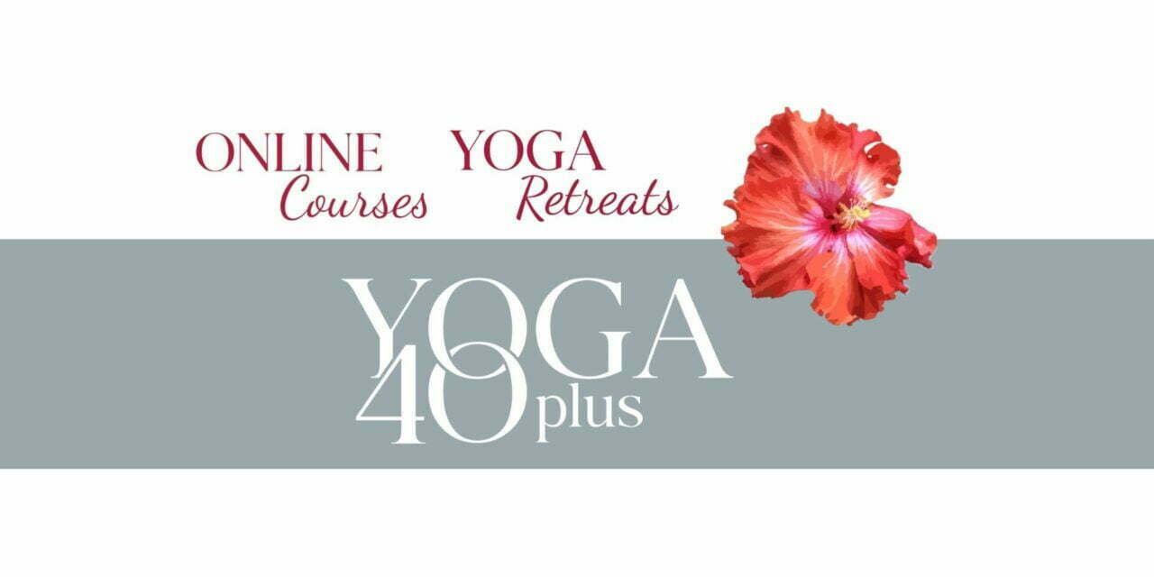
New Name and New Logo
One day a friend participated in the online course Yoga for your Back for the first time. At the end she told me: this class is for most women feeling stiff, not only for the ones with backpain. And she was right, I had always focussed on ladies over 40, motivating them to take action to move. Which helps to relieve backpain, of course. But not only.
It was time to renew both, Paths to Yoga and Yoga for your Back. Both got Yoga 40 Plus.
This meant to change everything: the company’s name, the url of the website, all pages on the website, all legal stuff like privacy policy etc.
In same time I made another big swift with a new platform for my community. Will tell you more about it next time.
The logo had to be redone properly, not only taking old bits and peacing. I hired a graphic designer, and that’s what we together figured out.
Y0ga 40 Plus in strong but still elegant fonts, with the zero and O interlaced. The names of the programs are with the same font and a second line more playful.
Do you like it?


Conclusion
I feel comfortable with names and logos right now. They are well visible, but not too imposing. Also, the names are clear about the content.
The hibiscus flower is not part of the logo anymore. But I can’t resist adding it from time to time. It is from a picture I took on Madeira, when I was living there in 2019. And you might have noticed: I love flowers.


